Reference text web fonts: ITC vs. URW Baskerville vs. Buenard vs. Caslon
I spent a couple of hours today looking at web fonts for legible reference text. After reading the New York Times experiment finding that Baskerville is "the king of fonts", I thought I'd give it a try, comparing it with a couple of others for legibility.
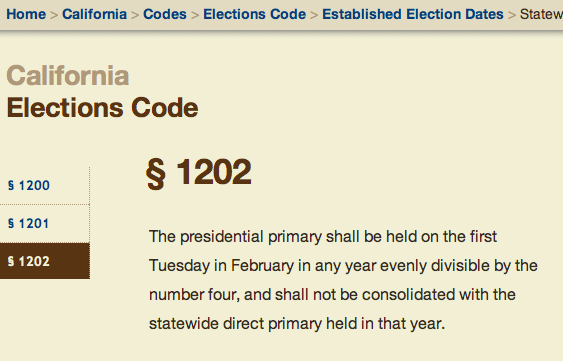
I first researched web fonts that I could test inexpensively. Then I tested them on a real web page. Here's what I found. Currently, text (and nearly everything else) is Helvetica Neue. (All screenshots from a Mac. I'll post IE tests soon.)

The sidebar is Trebuchet because I found that it's more legible for small numbers. I like the way this looks, simply visually. But legibility-wise, I believe the text ("The presidential...") is harder to scan with the eye than it ought to be.
Font of the Baskervilles?
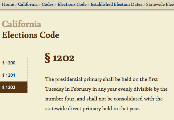
While looking for Baskerville web fonts, I found Buenard via Google Web Fonts. It's very close to Baskerville, and I find it amazingly legible:

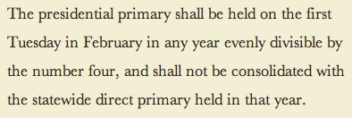
Finally, all the fonts for comparison:
| Helvetica Neue |  |
| ITC New Baskerville |  |
| URW++ Baskerville |  |
| Buenard |  |
| Caslon 540 |  |
My take: In Buenard, the words hold together the best. The letter spacing is tight and the font is heavy. I feel like it's super-easy to read. In comparison, in Caslon and Helvetica Neue, the words don't hold together as well. The fonts look good, but for web text to be read on a screen, I think that Buenard is the best here.
Member discussion