Oldstyle figures for better statute number legibility

I've been re-evaluating fonts for WebLaws.org, and one issue that caught my eye is the style of the numerals. In running text, these proportional oldstyle numbers (font: Buenard) are perfect: they visually flow with the text. The wide variations in figure height and positioning help the reader unambiguously read the number.


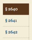
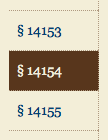
But in a vertical navigation bar, I've chosen Georgia for its monospaced oldstyle numbers: the monospacing enables the reader to easily compare numbers while scanning vertically. Best of all, the font is already installed on all platforms.
It's interesting that although the navbar numerals are in an entirely different font (Georgia vs. Buenard), the contrast is not jarring due to the sizes and positioning.
Research Trail
- Figuring out Numerals, the Font Feed blog
- Text Figures, Factbites
- Text Figures, Wikipedia
- Georgia (typeface), Wikipedia

Member discussion